What is Astro?
Astro is an all-in-one web framework for building fast, content-focused websites.
Key Features
- Component Islands: A new web architecture for building faster websites.
- Server-first API design: Move expensive hydration off of your users’ devices.
- Zero JS, by default: No JavaScript runtime overhead to slow you down.
- Edge-ready: Deploy anywhere, even a global edge runtime like Deno or Cloudflare.
- Customizable: Tailwind, MDX, and 100+ other integrations to choose from.
- UI-agnostic: Supports React, Preact, Svelte, Vue, Solid, Lit and more.
Start your first project
Get a new Astro project up and running locally with our helpful create astro CLI wizard!
# create a new project with pnpm
pnpm create astro@latest
# create a new project with npm
npm create astro@latest
# create a new project with yarn
yarn create astro
Prerequisites
- You will need Node.js - v18.14.1 or higher.
- Any Text editor - We recommend VS Code with our Official Astro extension.
Initialize project
Once you have installed astro using pnpm create astro@latest. You can run the application in your local browser on http://localhost:4321. Remember to install dependencies using pnpm install if they are not installed.
What is Astro Island?
The term “Astro Island” refers to an interactive UI component on an otherwise static page of HTML. Multiple islands can exist on a page, and an island always renders in isolation. Think of them as islands in a sea of static, non-interactive HTML.
Astro generates every website with zero client-side JavaScript, by default. Use a frontend UI component built with React, Preact, Svelte, Vue, SolidJS, AlpineJS, or Lit and Astro will automatically render it to HTML ahead of time and then strip out all of the JavaScript. This keeps every site fast by default by removing all unused JavaScript from the page.
---
import MyReactComponent from '../components/MyReactComponent.jsx';
---
<!-- 100% HTML, Zero JavaScript loaded on the page! -->
<MyReactComponent />
Using Client Directives
You can also use client:load to force astro load the page as soon as possible.
Note: This feature can only be used for framework components.
---
import MyReactComponent from '../components/MyReactComponent.jsx';
---
<!-- Most used client directives -->
<MyReactComponent client:load />
<MyReactComponent client:idle />
<MyReactComponent client:visible />
When and how to use client directives:
| Syntax | Useful For | Priority | Example |
|---|---|---|---|
<client:load> | Immediately-visible UI elements that need to be interactive as soon as possible. | high | <BuyButton client:load /> |
<client:idle> | Lower-priority UI elements that don’t need to be immediately interactive. | medium | <ShowHideButton client:idle /> |
<client:load> | Low-priority UI elements that are either far down the page (“below the fold”) or so resource-intensive to load that you would prefer not to load them at all if the user never saw the element. | low | <HeavyImageCarousel client:visible /> |
<client:media> | Sidebar toggles, or other elements that might only be visible on certain screen sizes. | load | <SidebarToggle client:media="(max-width: 50em)" /> |
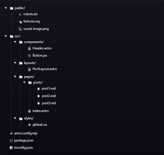
Folder Structure
Here is an example on how folder structue looks:
Component Structure
An Astro component is made up of two main parts: the Component Script and the Component Template. Each part performs a different job, but together they provide a framework that is both easy to use and expressive enough to handle whatever you might want to build.
Component Script
Astro uses a code fence (---) to identify the component script in your Astro component. If you’ve ever written Markdown before, you may already be familiar with a similar concept called frontmatter. Astro’s idea of a component script was directly inspired by this concept.
You can use the component script to write any JavaScript code that you need to render your template. This can include:
- importing other Astro components
- importing other framework components, like React
- importing data, like a JSON file
- fetching content from an API or database
- creating variables that you will reference in your template
---
import SomeAstroComponent from '../components/SomeAstroComponent.astro';
import SomeReactComponent from '../components/SomeReactComponent.jsx';
import someData from '../data/pokemon.json';

// Access passed-in component props, like `<X title="Hello, World" />`
const {title} = Astro.props;
// Fetch external data, even from a private API or database
const data = await fetch('SOME_SECRET_API_URL/users').then(r => r.json());
---
<!-- Your template here! -->
The Component Template
The component template is below the code fence and determines the HTML output of your component.
If you write plain HTML here, your component will render that HTML in any Astro page it is imported and used.
However, Astro’s component template syntax also supports JavaScript expressions, Astro <style> and <script> tags, imported components, and special Astro directives. Data and values defined in the component script can be used in the component template to produce dynamically-created HTML.
---
// Your component script here!
import Banner from '../components/Banner.astro';
import ReactPokemonComponent from '../components/ReactPokemonComponent.jsx';
const myFavoritePokemon = [/* ... */];
const { title } = Astro.props;
---
<!-- HTML comments supported! -->
{/* JS comment syntax is also valid! */}

<Banner />
<h1>Hello, world!</h1>

<!-- Use props and other variables from the component script: -->
<p>{title}</p>

<!-- Include other UI framework components with a `client:` directive to hydrate: -->
<ReactPokemonComponent client:visible />

<!-- Mix HTML with JavaScript expressions, similar to JSX: -->
<ul>
  {myFavoritePokemon.map((data) => <li>{data.name}</li>)}
</ul>

<!-- Use a template directive to build class names from multiple strings or even objects! -->
<p class:list={["add", "dynamic", {classNames: true}]} />
Component Props
An Astro component can define and accept props. These props then become available to the component template for rendering HTML. Props are available on the Astro.props global in your frontmatter script.
Here is an example of a component that receives a greeting prop and a name prop. Notice that the props to be received are destructured from the global Astro.props object.
---
// Usage: <GreetingHeadline greeting="Howdy" name="Partner" />
const { greeting, name } = Astro.props;
---
<h2>{greeting}, {name}!</h2>
This component, when imported and rendered in other Astro components, layouts or pages, can pass these props as attributes:
---
import GreetingHeadline from './GreetingHeadline.astro';
const name = "Astro"
---
<h1>Greeting Card</h1>
<GreetingHeadline greeting="Hi" name={name} />
<p>I hope you have a wonderful day!</p>
Adding Intigrations
Astro integrations add new functionality and behaviors for your project with only a few lines of code. You can write a custom integration yourself, use an official integration, or use integrations built by the community.
Integrations can…
- Unlock React, Vue, Svelte, Solid, and other popular UI frameworks.
- Integrate tools like Tailwind, and Partytown with a few lines of code.
- Add new features to your project, like automatic sitemap generation.
- Write custom code that hooks into the build process, dev server, and more.
Example on integrations
Astro includes an astro add command to automate the setup of integrations.
Run the astro add command using the package manager of your choice and our automatic integration wizard will update your configuration file and install any necessary dependencies.
npx astro add reactIt’s even possible to add multiple integrations at the same time!
npx astro add react tailwind partytownThe astro.config.mjs will be updated once added integration:
import { defineConfig } from "astro/config";
import installedIntegration from "@astrojs/vue";
import localIntegration from "./my-integration.js";

export default defineConfig({
	integrations: [
		// 1. Imported from an installed npm package
		installedIntegration(),
		// 2. Imported from a local JS file
		localIntegration(),
		// 3. An inline object
		{
			name: "namespace:id",
			hooks: {
				/* ... */
			},
		},
	],
});
